Badi is an app that helps users to share apartments as flatmates in important cities in Europe (Barcelona, Paris, Rome, Madrid, London, etc.) Users can list their empty rooms and create profiles from which they interact by chatting with other users interested in their rooms. This model, although easy, was not present in the majority of cities mentioned when we were working on this product. Similar products were in the market, but they didn't promote user-to-user interaction as equals or as a horizontal transaction.
When I joined the team to contribute to the design of the product, Badi was faced with the challenge of starting monetization, and one of the strategies that we followed was room reservations, which could be beneficial for different types of users and contexts.
The team:
1 Product manager
1 Product owner and Product designer
Me: Product Designer and Researcher
The timeframe
We finished the design phase in 4 months
1. Competitor analysis
The first step as a researcher was to start with the competitive analysis. The product needed to cover different European markets which have different legislations, different social interactions and different ways to approach renting issues and scenarios, which increased the difficulty of our product design. By analysing the different competitors and how they approached different products we could learn a lot about how to do some things and how to avoid some things that were a no-go for us.

2. User interviews and investigation
We conducted 5 interviews via Zoom and analyzed survey results and customer support tickets and comments. We debriefed the results to have a better idea of the topics that resonated the most with our "personas".
Here you can see the affinity diagram done with the main user answers and the categories that were created while classifying the raw data.

Affinity mapping grouping with all the users' answers
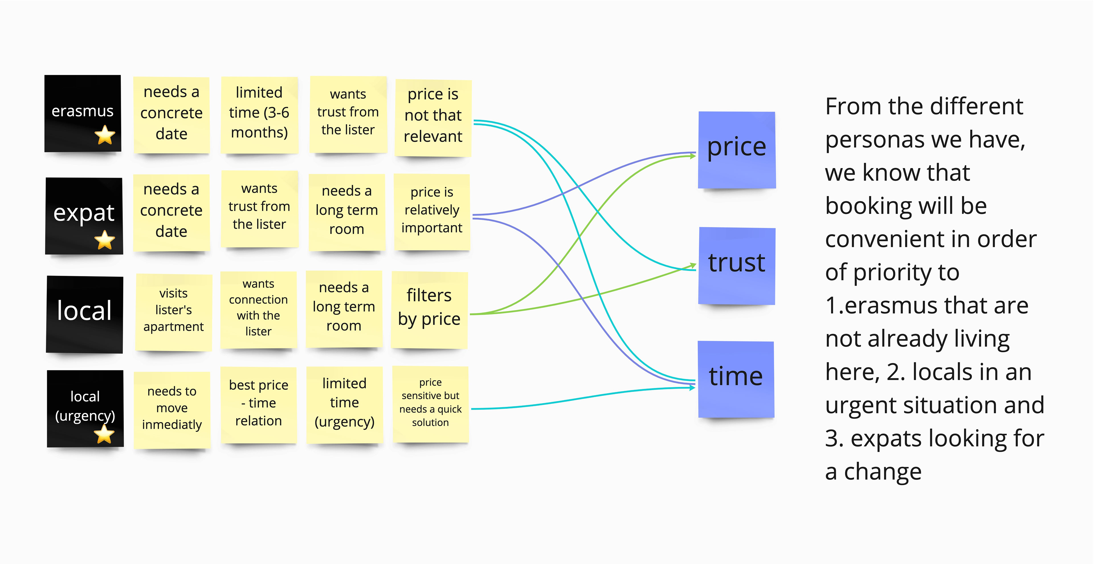
We had 4 types of personas (The Erasmus Student, the Expat, the Local and the Urgent Local). These 4 types of personas had different needs and different perspectives of what was the most important for them in their contexts.
In this super simple diagram we could extract the information needed to establish who would be the users that could use the reservation feature the most. The 3 most important elements that divide the different personas are Price, Trust and Time. From interviews and all the customer services research, we can deduce that Erasmus, Expats and Urgent locals would benefit from this new feature, which was great too in terms of business strategy.
3. User journey for Listers and Seekers
We started drafting what the experience of reserving a room would look like for Listers and Room Seekers. The timing of the journey was important here to avoid frustration.
We wanted the process to be bidirectional, meaning that both Listers and Seekers could send a reservation request. Listers could propose to a user they like to reserve their room and seekers could request the reservation of the lister's room.
All these interactions imply different statuses and different resolutions that are briefly reflected on these user journeys.

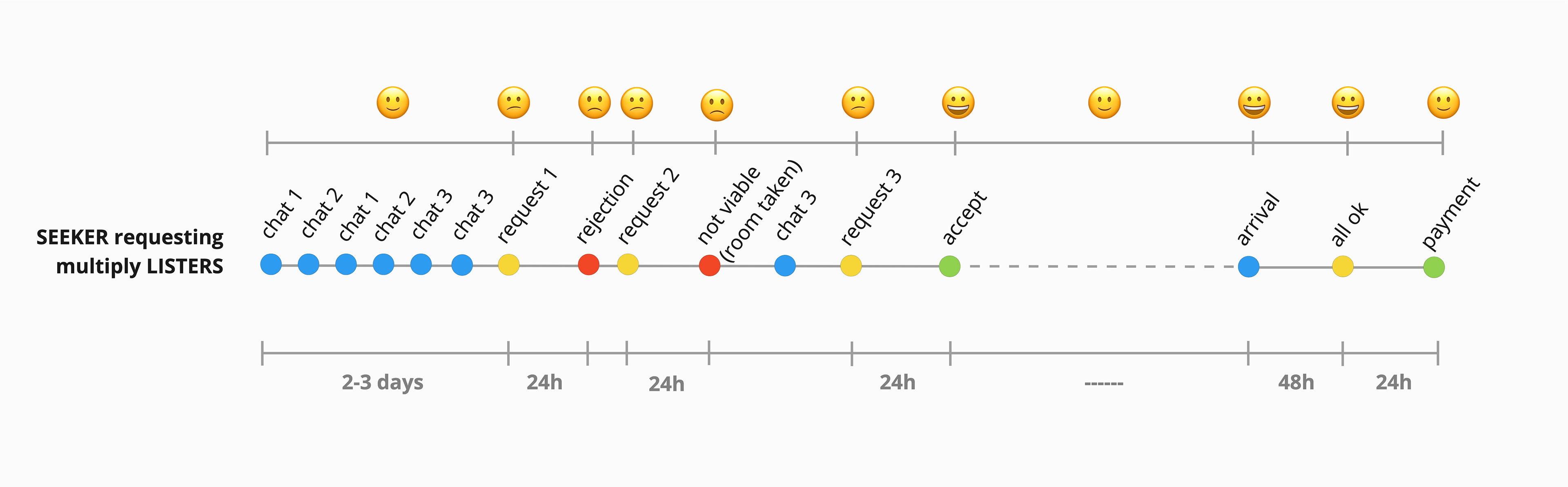
Lister and seeker user journey. We took into account the timing expected for each of the interactions to plan the total time from publishing a room and completing a reservation.
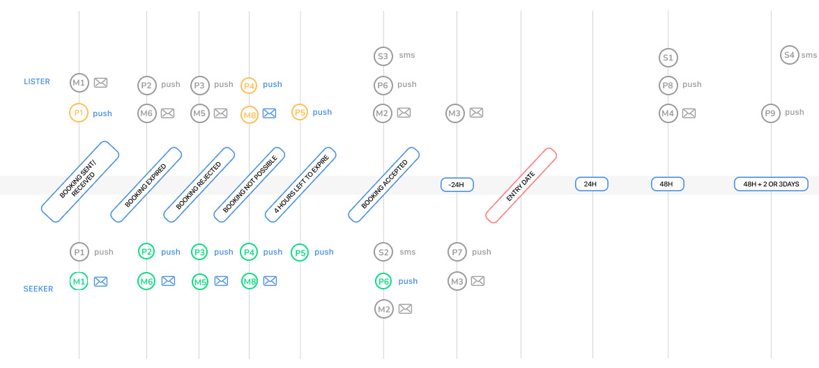
4. Emails and Push notifications system
We started drafting what the experience of reserving a room would look like for Listers and room Seekers. The timing of the journey was important here to avoid frustration.
We wanted the process to be bidirectional, meaning that both Listers and Seekers could send a reservation request. Listers could propose to a user they like to reserve their room and seekers could request the reservation of the lister's room.
All these interactions imply different statuses and notifications that are briefly reflected on these user journeys.
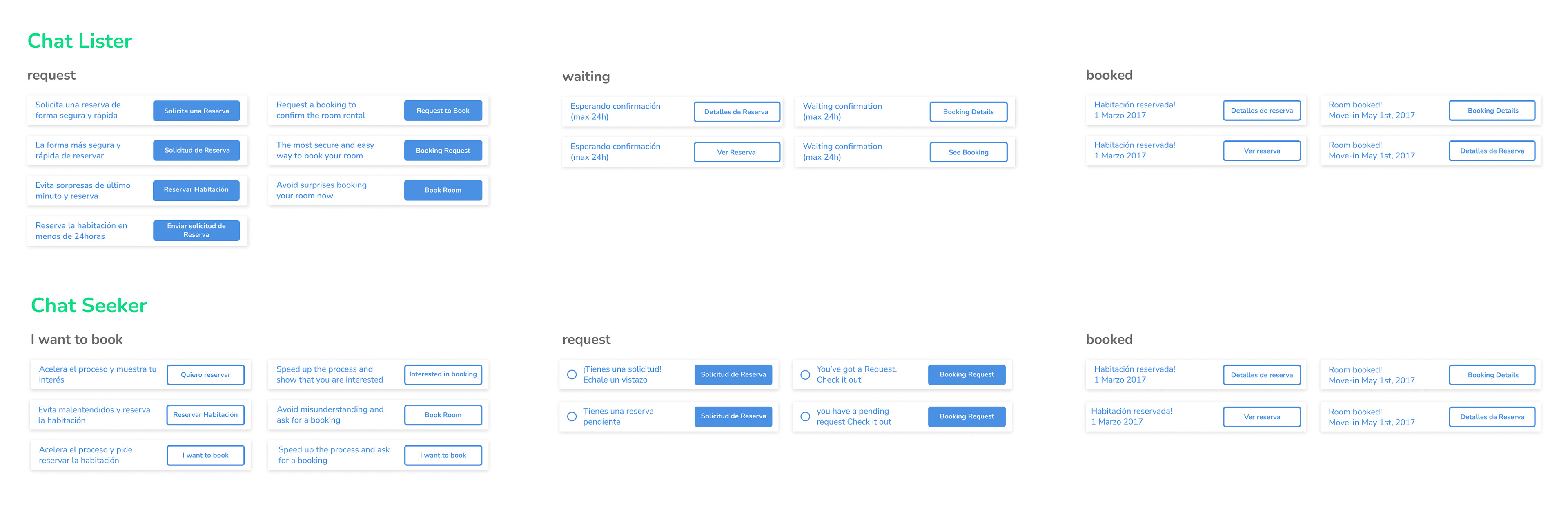
5. Reservation statuses
We also designed and planned all the statuses that seekers and listers could encounter in our app. What's shown here are the different messages we were displaying in the app when the user needed to make a request, when the user was waiting for an answer and when the booking was finally completed.
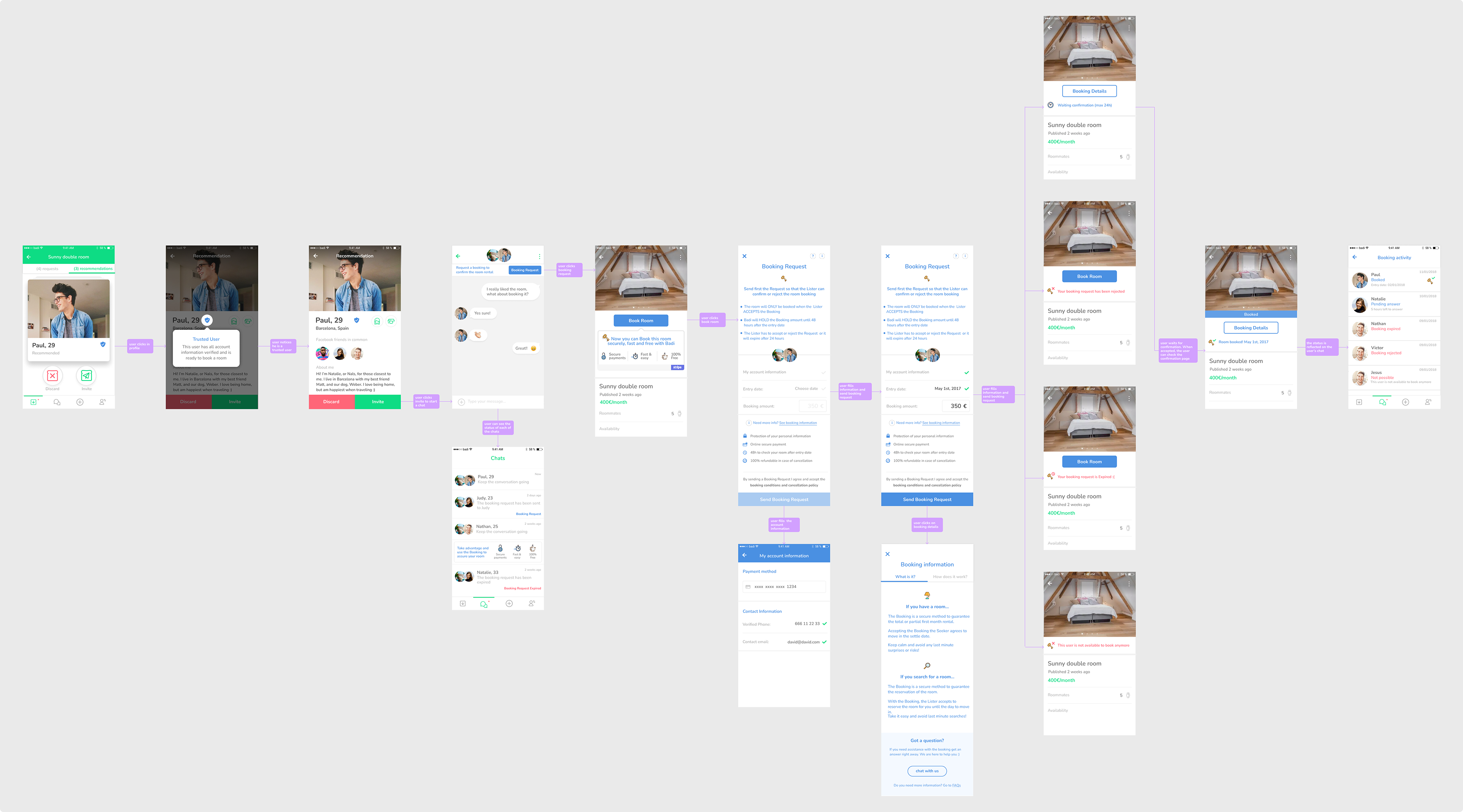
6. High-fidelity flows and prototype
After understanding the different statuses and the different possible results and paths that the user (lister and seekers) could take, we designed the screens following Badi's design system. The following flow shows the matching process, the chat between seeker and lister, the option to make a reservation of the room, the details before making the reservation and the different statuses of the reservation process before finalising it.
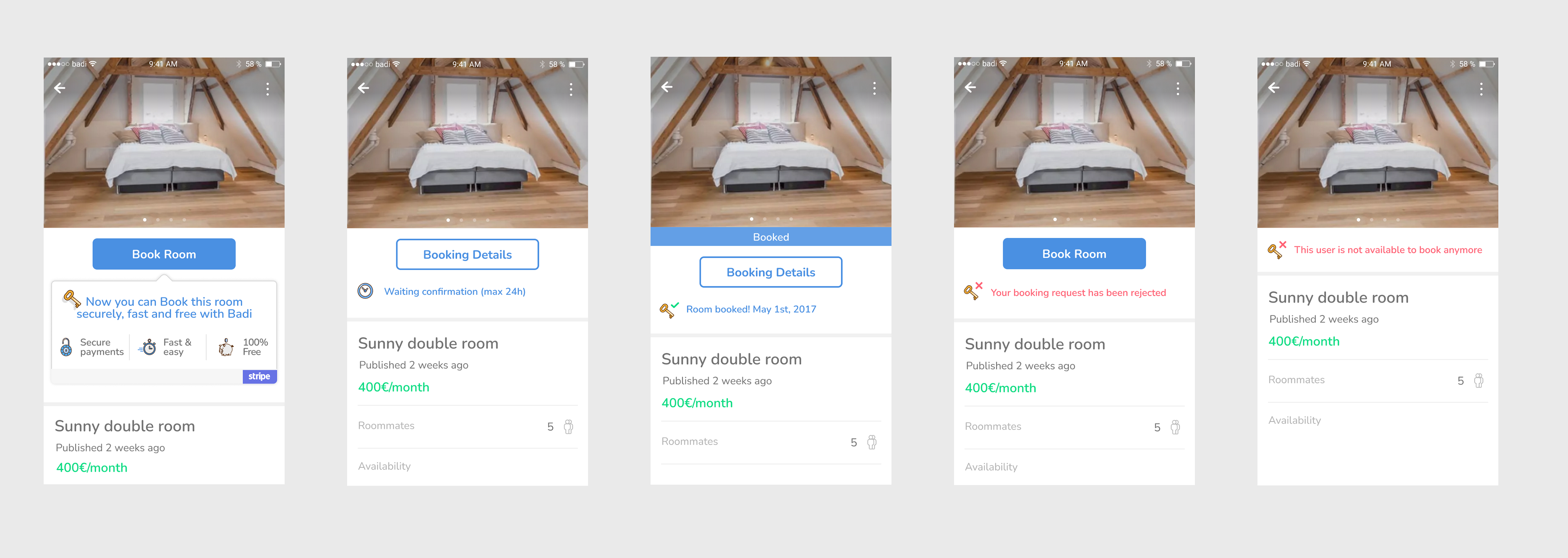
A close-up view of the different statuses of the reservation once the request has been made.
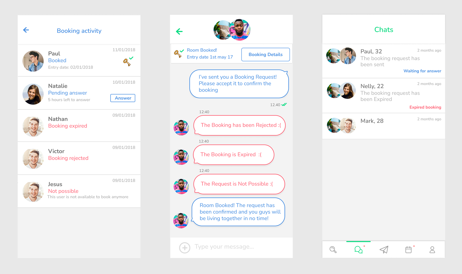
A close-up view of the chat screen and the booking activity where we can see the different outcomes we could find between lister and seeker.
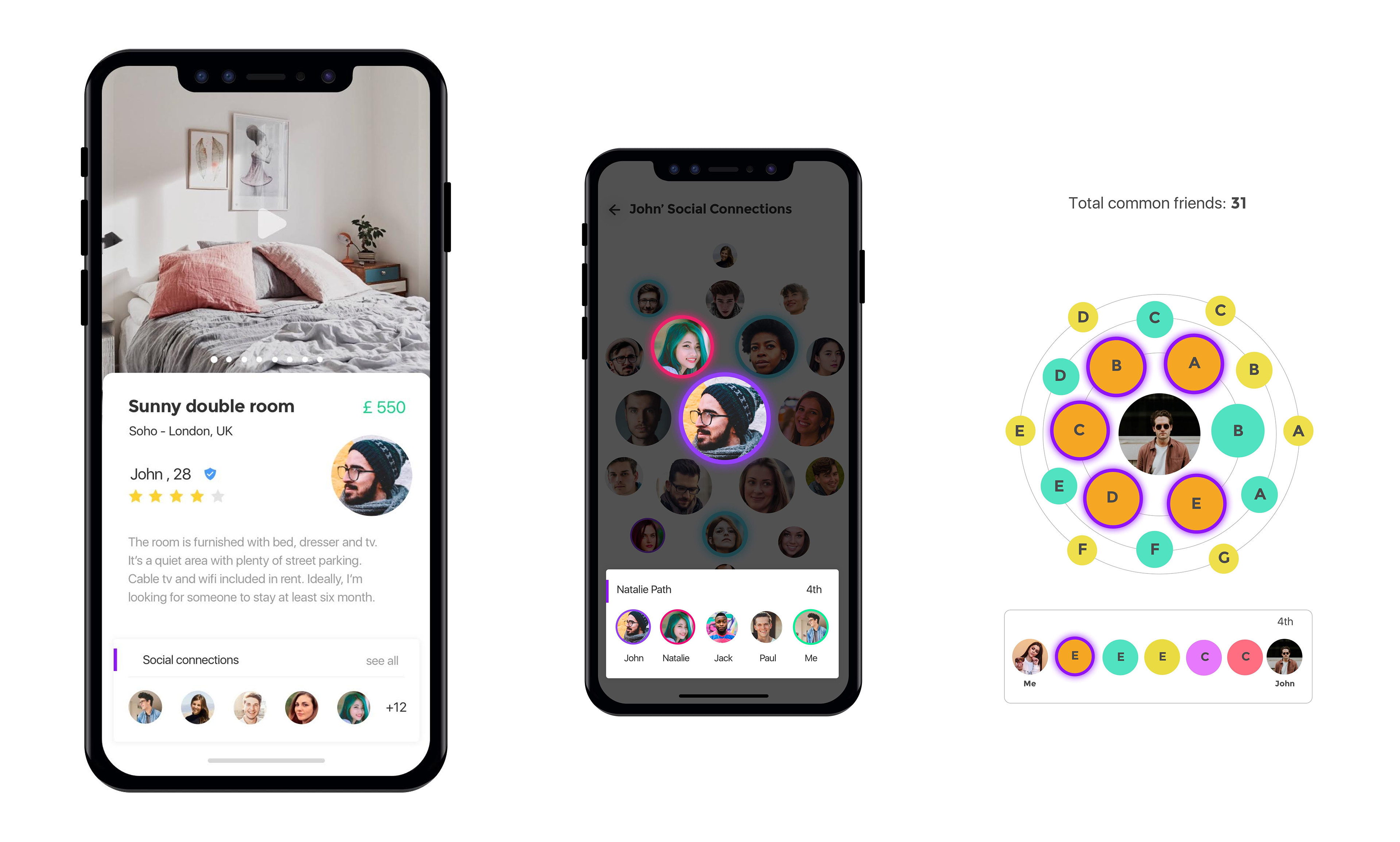
7. Social connections (Next steps)
8. Figma's interactive prototype
Have a closer look at the reservation's feature following this Figma link