Sage's Make Tax Digital app is a tool for sole traders that allow them to create transactions, categorize them, import them from their bank accounts and submit the returns to HMRC's system. This product has been developed from the beginning to the end in a bit more than a year and a half with a team of 3 mobile designers, 2 content designers, 2 solution designers, 1 product manager, and 10 developers.
The case I'm showing here is mostly about Refunds and Transfers, 2 types of transactions that the user can create inside the app.
For the design of this project, a 2-day workshop inspired by the Google design sprint was conducted, together with web designers, content team members, and product managers. For mobile, I was the owner of the UX and UI work and we worked together with a solution designer and a content designer.
Workshop goals and purposes
· Increase team IQ with a deeper understanding of transaction types and use cases
· Discover the data elements that make up the inputs and outputs for these transactions
· Identify commonalities to deliver a consistent and intuitive pattern to process transaction types.
· Reduce estimations so we have more resources to 'spend' in new more undefined areas of the application.
· Create low-fi Miro wireframes that aim to deliver our early hypothesis and approach. With the purpose of contributing to an architecture and compliance feasibility review.
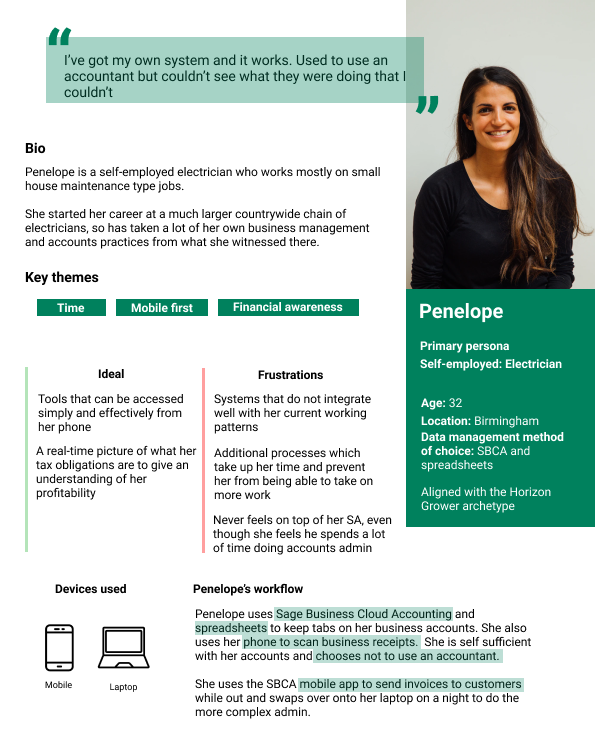
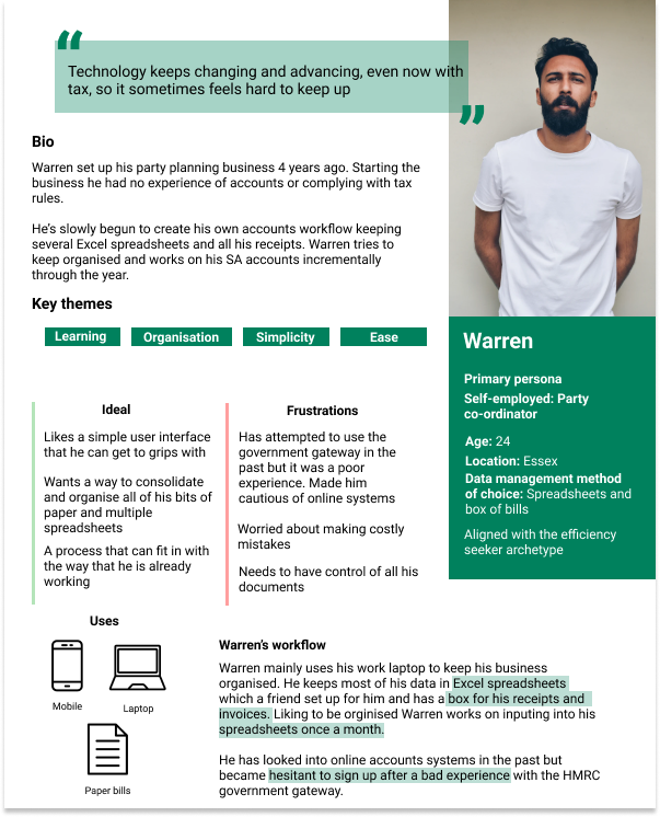
Our users
No project can't start without a reminder of our users. In this case, we pulled out our primary personas. Both of them are self-employed workers, in charge of their own accountancy and in need of a precise and easy tool to have control over their expenses and income and the late quarterly tax return. The biggest difference between them is that Penelope uses the mobile phone as the main tool while working and Warren uses it only as a companion app in certain moments.
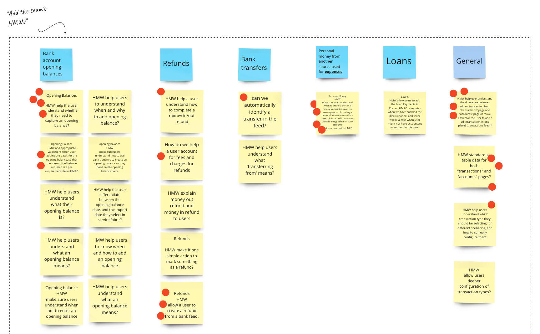
Listening to the experts and HMWs
To start understanding the problem, we did a team session with experts in the field to know more about these types of transactions, what they imply and what could be pain points for our users. This was a structured discussion where we listened to our Experts in accountancy and taxes and collected all the challenges and doubts that come up during the interview.
After that, we started creating HMW's that helped us define our biggest challenges without prescribing a solution. We voted on the most relevant ones.
The requirements and the project structure
After knowing more about the main pain points, needs, and challenges, the next necessary step was to understand in more detail the particular requirements of each of the special transactions we were designing for.
In this case, we thought about the type of transaction that could be (money-in or money-out), what were the main inputs and outputs for each transaction, and the type of service it belong to (the other technology teams that were implied in these features).
All these were not only useful to start our ideation process but also as a way to understand more about the backend implications.

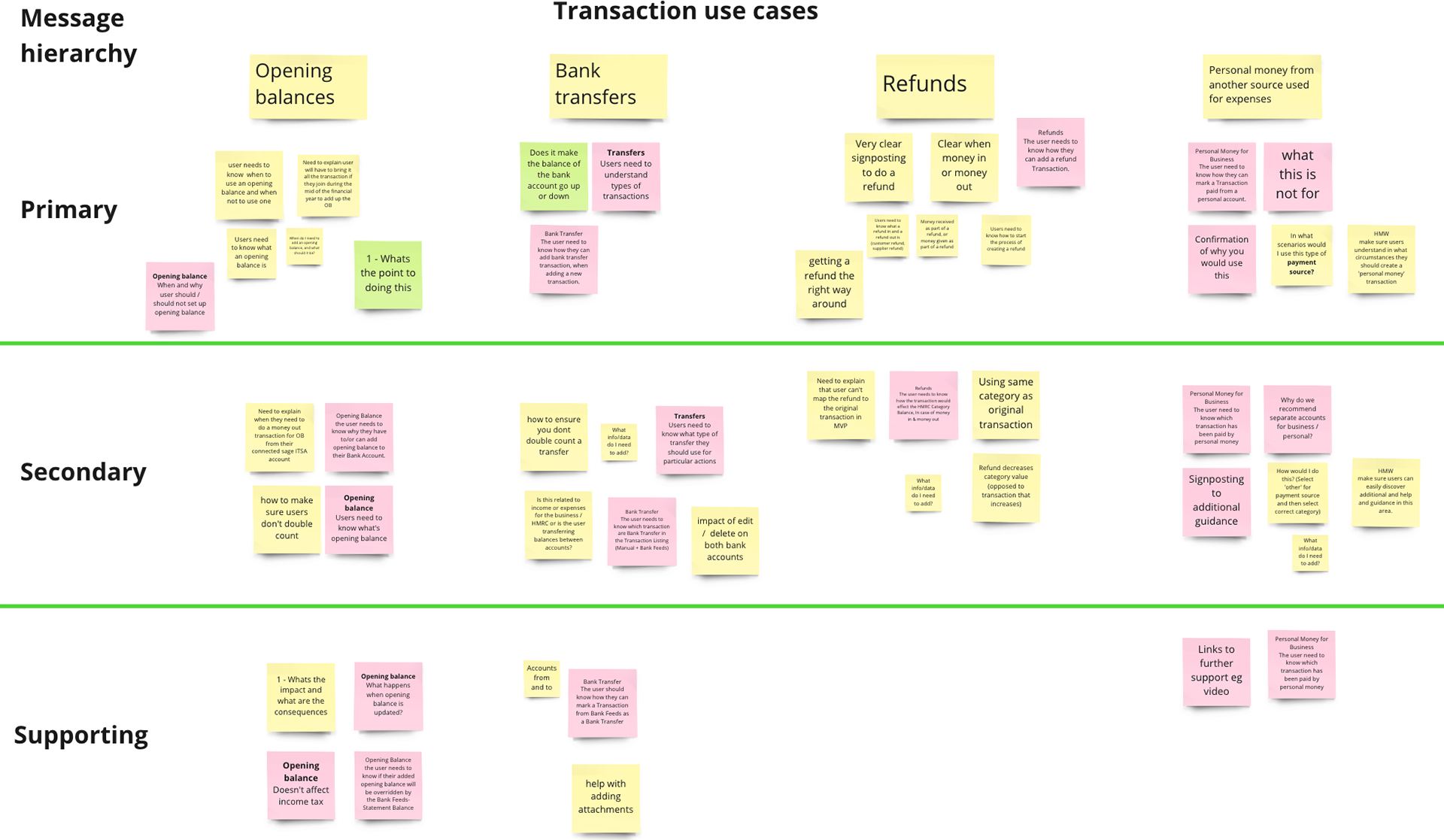
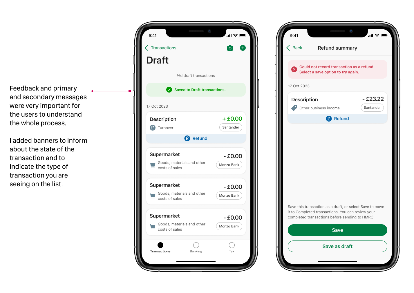
Primary and secondary messages and supporting screens
We also created this basic matrix to brainstorm about the primary, secondary and supporting messages we needed to deliver to the users so everything was clear to them. This is not just helping text but the way we wanted to display the main information to be easy to process for all our users. As a group, we discussed the types of messaging and hierarchy and added them to the messaging hierarchy chart for each transaction use case.
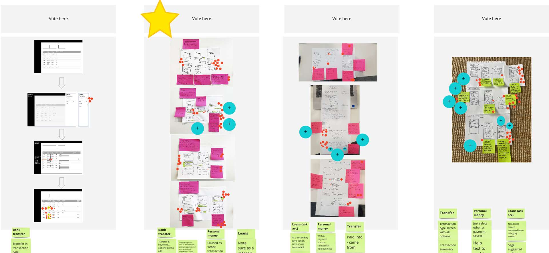
Sketching and voting
We wanted to get everybody's ideas on how to solve the challenges. The chosen solution would be prototyped and validated to get feedback from real users.
After revealing the anonymous sketches we went through voting. We wanted to "create visual heat" by giving out red dots to the ideas we liked.
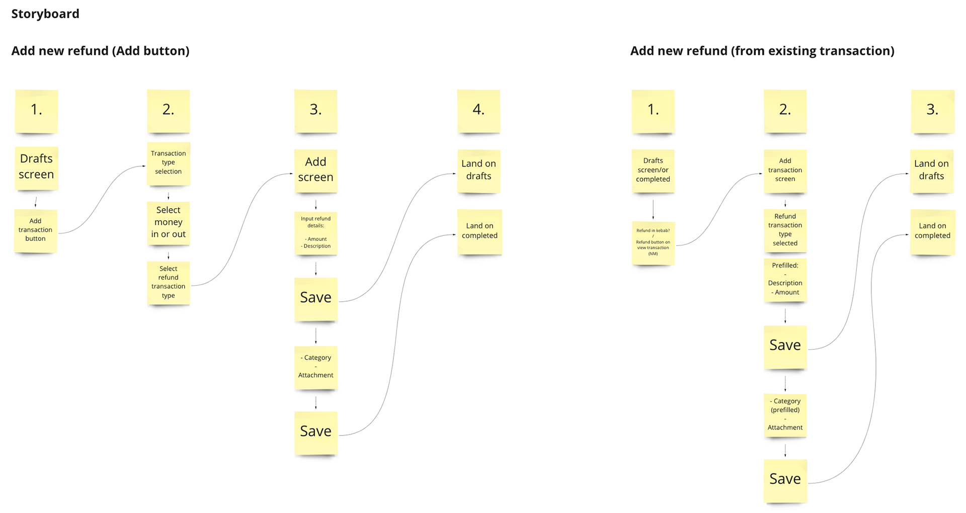
Refunds' Storyboards
We had a clear winner after the voting process. This gave us the clear direction we needed to start creating a storyboard that would help us create the first wireframes for the project.
I have added here 2 of the several flows we needed for refunds: Add a new refund and Add a new refund from an existing transaction. Other flows that were included on those storyboards were Deleting a transaction marked as a refund, Editing a refund, and the particularities of manual transactions vs. bank feed transactions marked as refunds.
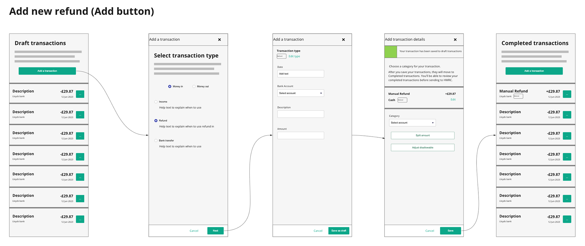
First refund's low-fi wireframes
This is the polished version of the "Add new refund" flow.
The user would click on "Add a transaction". They would select the type of transaction depending on if it's a money-in or money-out one. They would click on "Refund" and "Next" to keep going. On the refunds screen, they could add the date, the bank account, the description, and the amount of it and "Save it as a draft". The next screen would show the details or summary of the refund they have just created. From here they could have the option to split the amount into different categories or save it as it is. The refund transaction would appear in the list of completed transactions at the end of the journey.
Testing
The workshop ended with a user testing on the main flows with 5 different users.
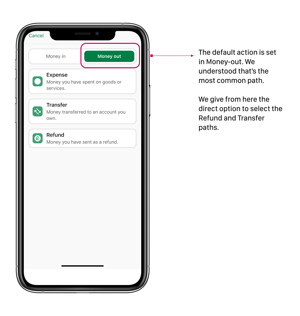
The main issues we detected and that I modified on the high-fidelity prototype were the following:
1. Start the journey with a money-out default option (it is the most common one)
2. Split the journey into 2 to avoid overwhelming the user with so many text fields.
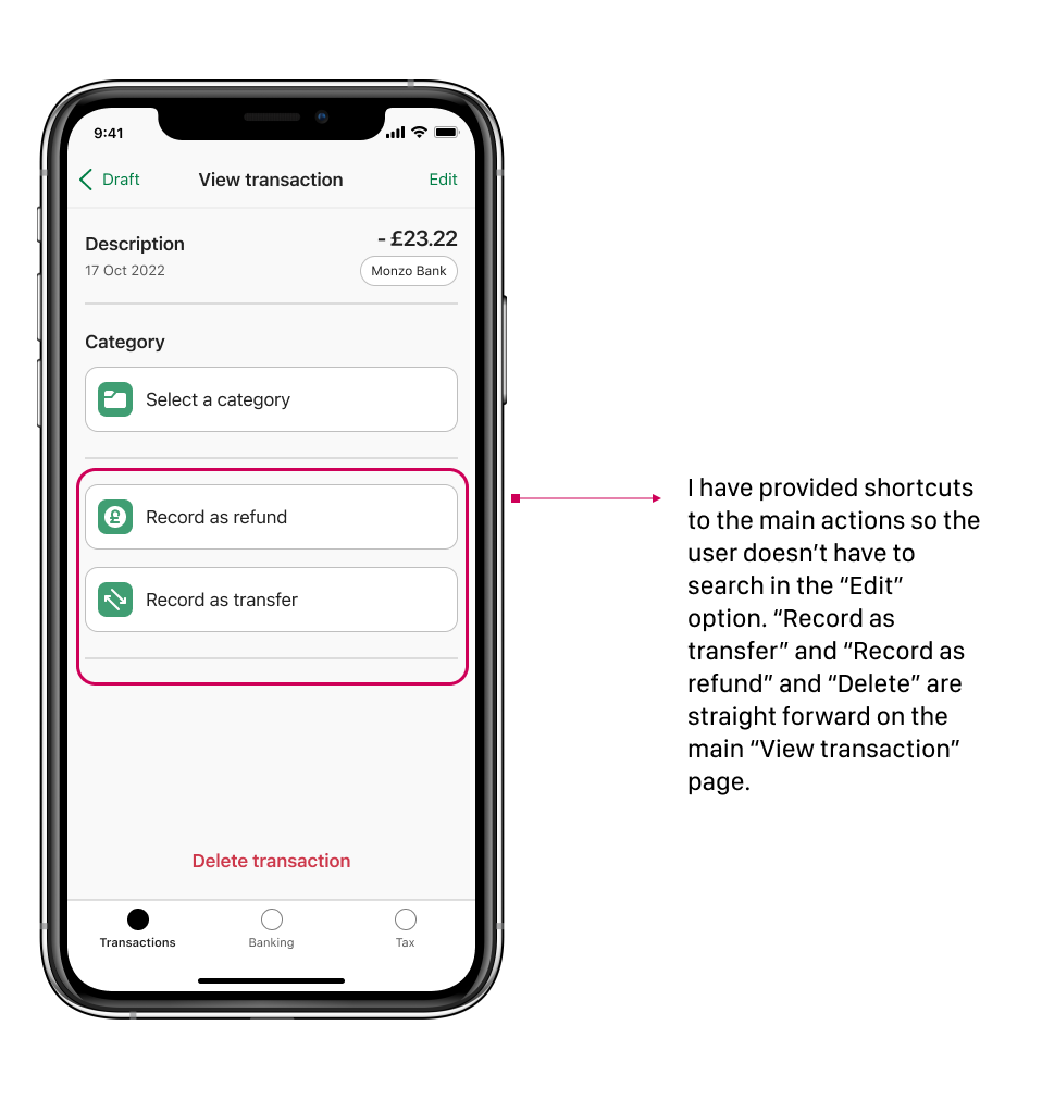
3. Give shortcuts for important actions (undo the refund, create a refund and transfers, delete the refund, etc.)
4. Display only the categories that correspond to the refund option selected.
5. Give more precise feedback to the user when the transaction is saved.


.
.
Next steps
The refunds and transfers need to be tested a second time, along with the other types of special transactions. The intention is to provide the user with a real-life situation that implies different types of transactions and contexts.
The main complexity of this project was to align all the team members, working on the other types of transactions to agree on paths that needed to be common. I think we have succeeded so far, but we need to wait until this project sees the light!