About the company and the project
Sage is one of the biggest software companies in the UK. With more than 11,000 workers in the whole world, we work to deliver the best accountancy and HR software and apps for all types of clients, from big companies to sole traders that search for the best solutions to manage their company's data. Sage's Individual app is a tool for sole traders that allow them to create transactions, categorize them, import them from their bank accounts and submit the returns to UK's HMRC system.
Introduction
This product has been developed from the beginning to the end in more than a year and a half with a team of 3 mobile designers. Apart from the design team, we worked with the following people:
2 Product Managers: To understand and brainstorm the scope of the project and its requirements, and to understand the roadmap.
2 Solution Designers: To mediate between the design part and the technical part, and understand more about the limitations of the project in terms of the backend, APIs, etc.
2 Content Designers: To work together on how we speak with the user, the content, the tone, the help text, but also the strategy and the app structure.
10 Engineers: To ensure that the final output looked exactly like the designs and to receive feedback about the feasibility of the designs proposed.
The product is complex and has many features, but here I'm highlighting one of my favourite parts, the dashboards. From the first investigations to user research to final results (to iterate in the future), this is one of the challenges that I enjoyed the most while working on this product.
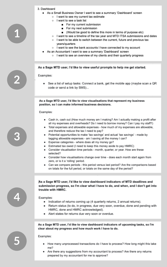
First user stories to start ideating the first data visualization
Breaking down the problem statement
We didn't know much about the dashboard when we started this project. We knew what the main features we were gonna launch with, but no idea about how the main data could be visualized, how it would be more helpful and relevant for our users and how to organize all these data in a meaningful way.
We started with a list of specifications and assumptions that we organized in a user stories list, but we needed to test if that was a good way to follow.
To discover all that, we looked to our users and organized workshop sessions, user tests and card sorting that helped to understand a little bit more. We also looked to other competitors and other examples of data visualization that were very useful.
Let's have a look at all this information below.
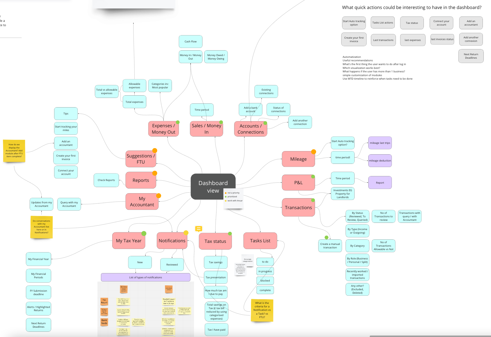
first map with all the concepts we need to add to the dashboard and its priorities
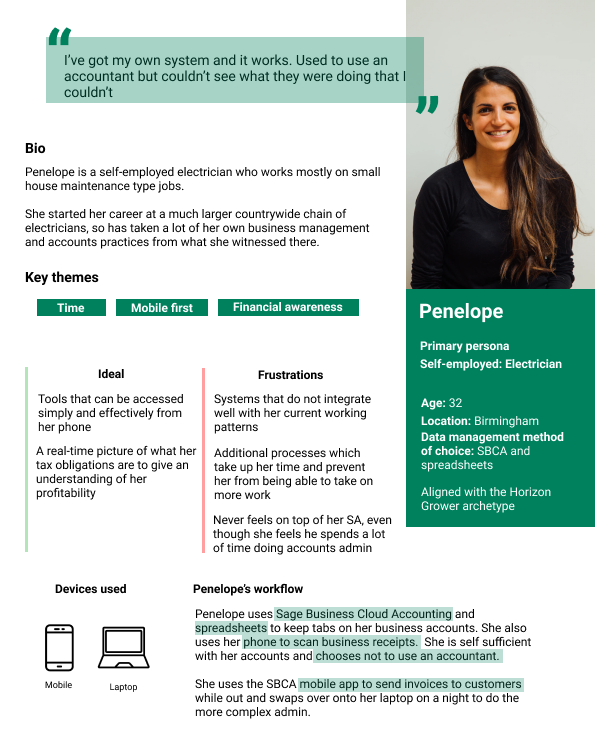
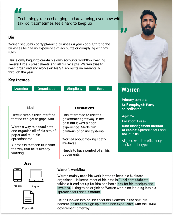
Our users
No project can't start without a reminder of our users. In this case, we pulled out our primary personas. Both of them are self-employed workers, in charge of their own accountancy and in need of a precise and easy tool to have control over their expenses and income and the late quarterly tax return. The biggest difference between them is that Penelope uses the mobile phone as the main tool while working and Warren uses it only as a companion app in certain moments.
Competitors and data visualization examples
To gather inspiration and gain more visual depth and knowledge we had an exhaustive look at our competitors, but also at other apps that were tackling similar problems or that were very strong on data visualization and graphs. The research was much bigger than that, but you can see here some examples of things that we were looking for in the research, like timelines, cards, data comparisons, visual and ludic ways to visualize data, First Time Use examples, etc.
Some examples of data visualization of other apps
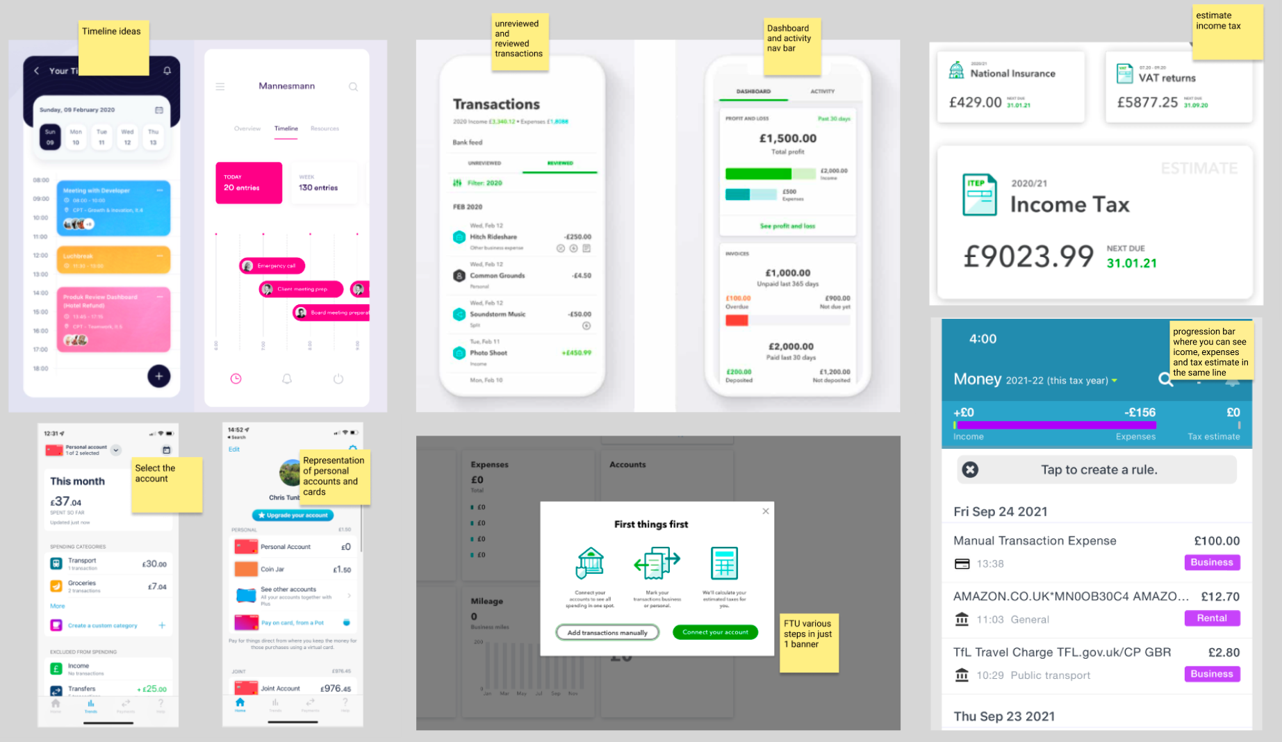
First sketches
After all the research on visualizations and knowing a bit more about our users, our main user stories and a map of prioritization, we decided to start designing some modules for this dashboard. The dashboard was a common element for mobile and web, so I paired with the web designer to nourish our exploration. We benefited a lot from designing for web and mobile at the same time, highlighting or hiding primary and secondary information depending on the space we had.
These are some of the designs we started to design and wanted to test with the users.

User testing and card sorting
For now, what we had were modules of information and data about the different categories we thought the user would like to see in the dashboards. But we wanted to know their opinion about these designs and also about how they would love to see this information organized. We wanted to know about their mental models to understand what made sense to group together, so we combined user testing with a simple card-sorting exercise. This research was done by myself and a colleague from the user research team.
This research was done with 15 users, between 25 and 65 years old, all sole traders.
We had great insights into the module designs and how we could organize the information.
The following pictures show a bit of the results of the tests.
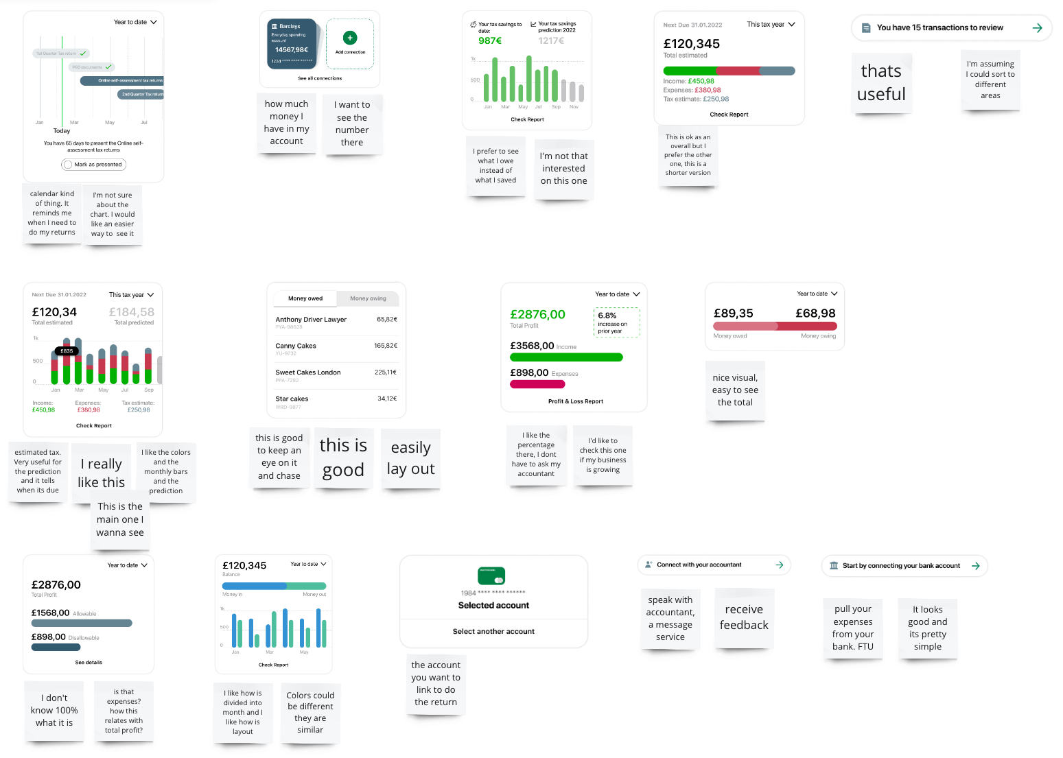
Research notes while we interview one of the users.
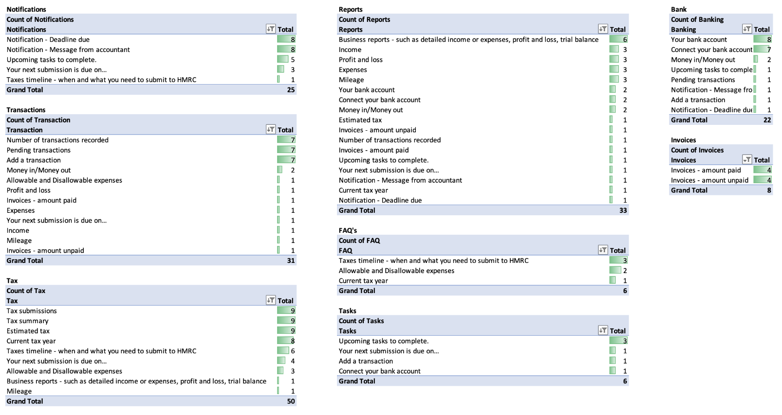
Card sorting results where we can see how the users would categorize the content
User testing results
The main results gave us a clear idea of how users wanted to see the main categories. The resulting categories were: Notifications, Transactions, Taxes, Reports, Bank, Invoices, FAQs and Tasks.
Moving forward, we took these categories into account, although not all the categories were included in the MVP (notifications or reports, for example).
In terms of the visual aspects of the dashboard content, the main things we took into account were:
· Taking care of how we use the colours. Good contrast and positive and negative colours are important.
· Much simpler graphs. Users get frustrated with too complex graphs. It is better to have 3 graphs explaining simpler data than combined graphs.
· Use of hints and next steps. Straightforward content that tells the user what needs to be done next is much appreciated.
· Comparative timelines and the option to change time views easily are a must for the user.
· Gratification, motivation and gamification are ways to engage with the user. Designs that showed positive outlooks and predictions about taxes were very well received.
Next steps and reconsiderations
The first user testing helped us understand more about what visuals worked and which not, what was confusing for the user, what were the most useful visualizations and how would data make more sense to be grouped.
The project stayed on standby for several months at this point. We needed more information about the other features we were developing in parallel and how much information were we capable of pulling from them. This was a completely new product and the APIs and the backend were completely new, so we needed more information before moving forward.
This time also gave me time to reconsider how dashboards should look on mobile. The last Apple conference was eye-opening in this case. One of the things they talked about was about the importance of not duplicating content in dashboards. Instead, they were proposing contextual dashboards, for each relevant category. We talked about this approach with the team and it started making sense for us. Our main categories were Transactions, Banking and Taxes and I started redesigning the modules taking that approach in mind and after doing a small workshop with web and mobile teams to reconsider the modules.
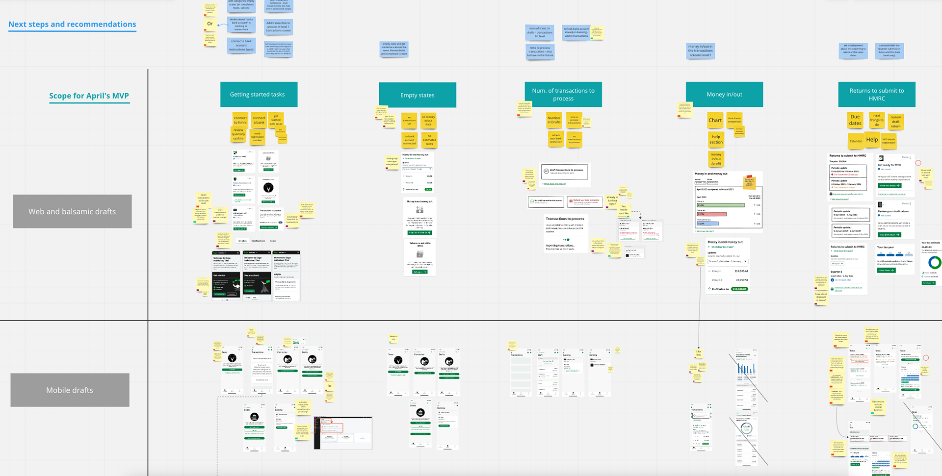
Workshop taking into account the web modules and the mobile ones for the first release. The main categories to design here were First-time use and empty states, Transactions, Money in/out and Taxes submission.
First proposals for contextual dashboards in Transactions and Taxes
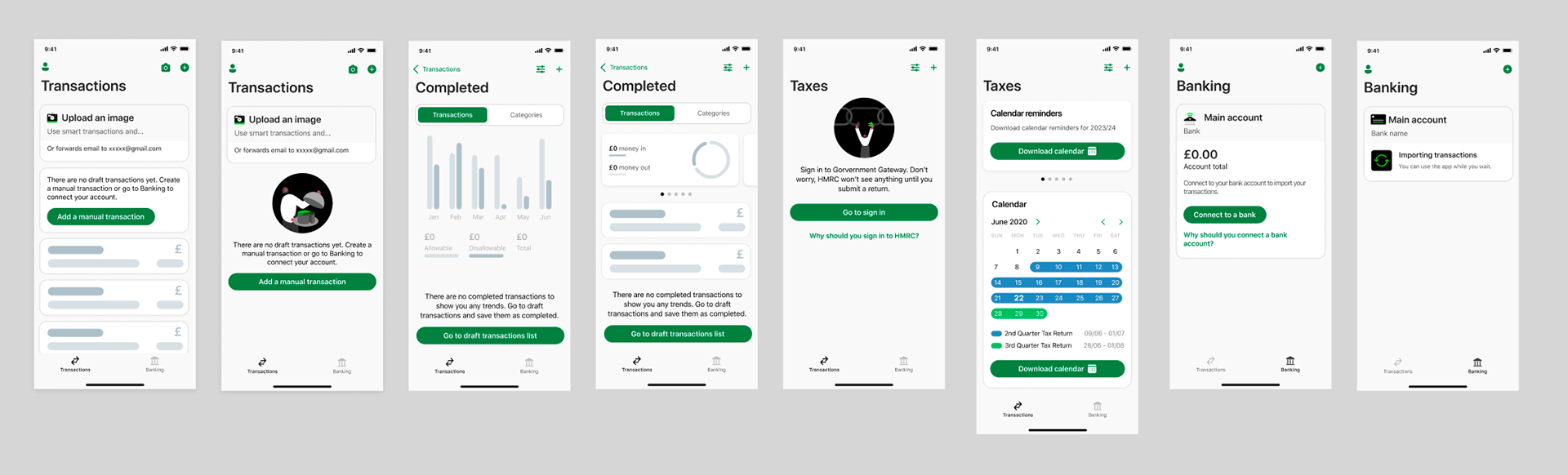
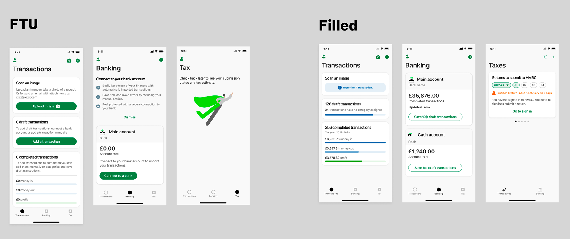
First-time Use designs
We also tackled the first-time use designs, so they could be engaging and have the potential to guide the user on the most important steps in the app.
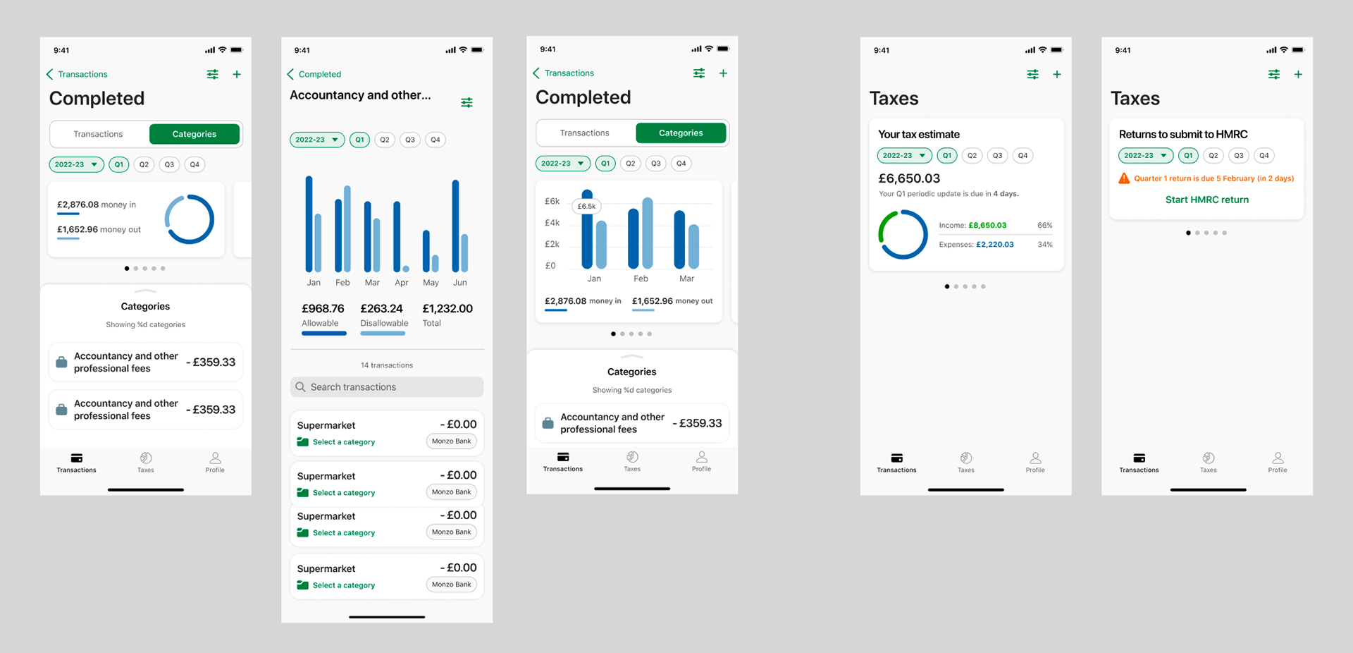
First release designs
The first release hasn't taken place yet but we have a clear idea of the content it's gonna appear there. Although the final screens haven't been tested yet, we plan to do so once the product is live, with the first users of our app. At this stage, the product will be only available for accountants who have been using Sage in the past and are our product advocates.
These are some final screens for this MVP.
Learnings and next steps
The dashboard for MTD taxes was a complex task to complete. We had to move forward and backward several times, adjusting user needs and backend possibilities for this initial stage of the product. All in all, I have learned a lot about data visualization, the purpose of the dashboards and how to guide users to the best experience when they first land our product.
The product is gonna be released in a month and I can't wait to test it and iterate on all this work.